Roles
Duration
Process
Roles
Product Designer,
UX Researcher
Duration
6 Weeks
Process
Competitive Analysis, Content & IA Audit, Sitemap, Card Sort, User Persona, Survey & Prototype Tools: Optimal Workshop, Figma
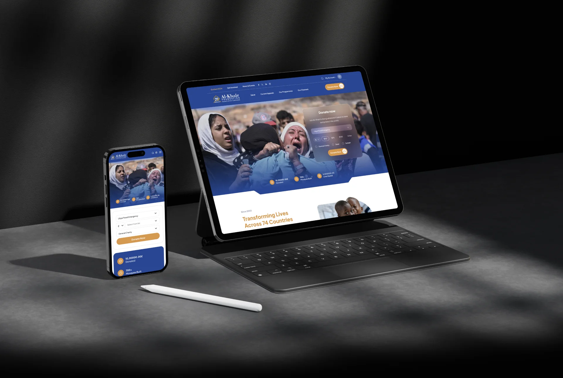
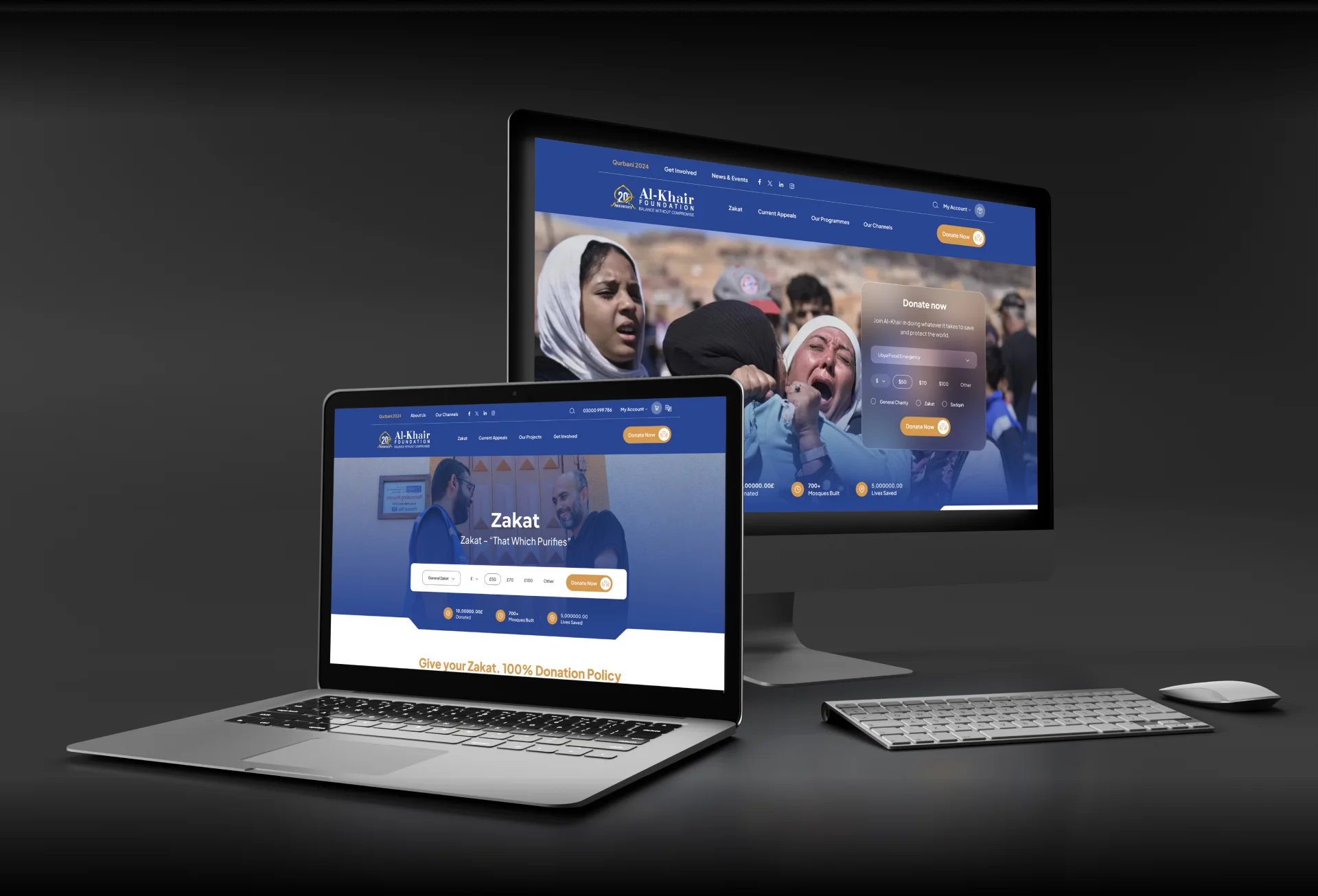
Alkhair.org, a platform dedicated to facilitating charitable contributions and volunteer engagement.
Design Process
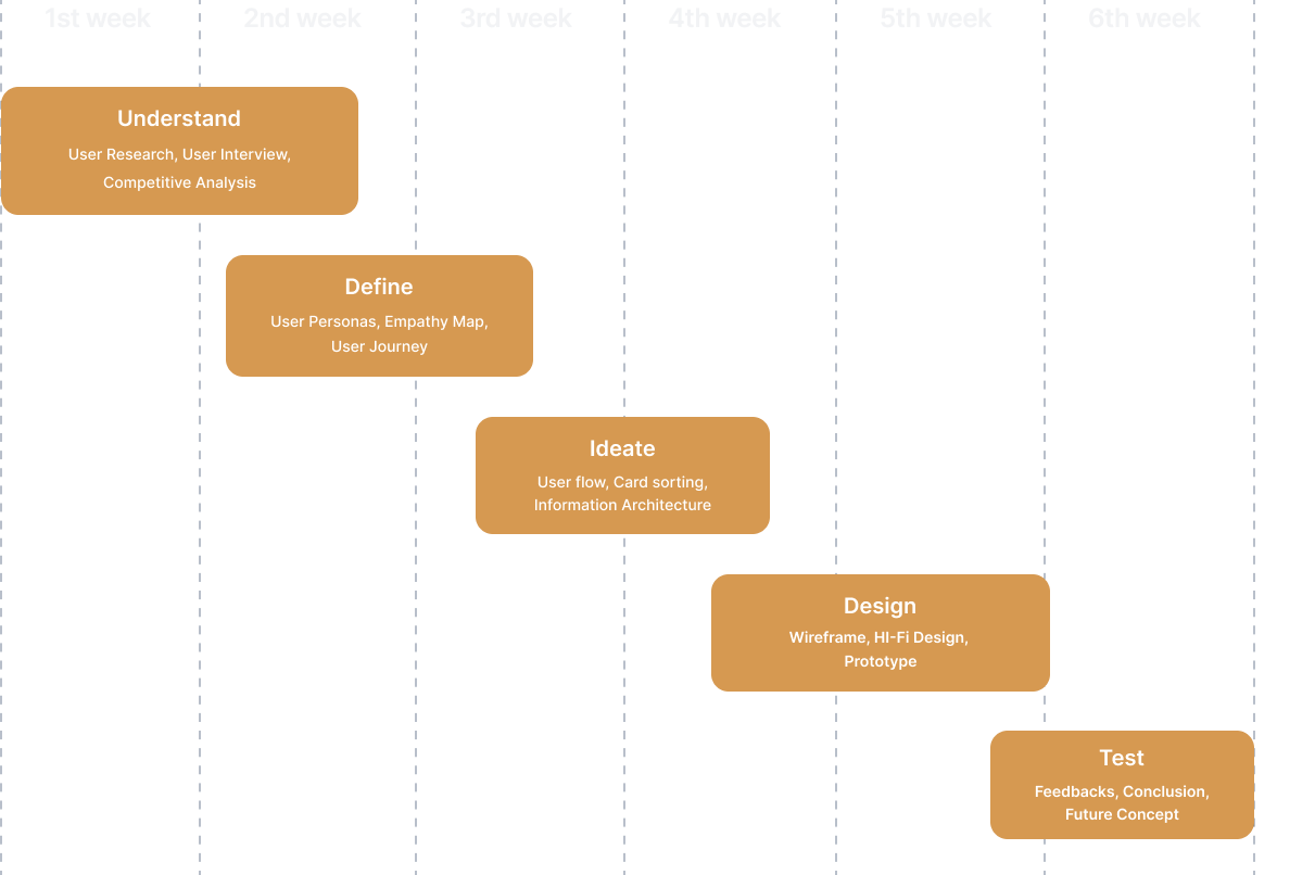
Our design journey followed a structured process, encompassing key phases to ensure a comprehensive solution. The process involved understanding the problem, conducting thorough research, identifying personas, and addressing multiple problem statements. Each stage was meticulously executed, setting the foundation for an impactful redesign of the platform.
Understand
- User Research
- User Interview
- Competitve
- Analysis
Define
- User Research
- User Interview
- Competitve
- Analysis
Ideate
- User Research
- User Interview
- Competitve
- Analysis
Design
- User Research
- User Interview
- Competitve
- Analysis
Test
- User Research
- User Interview
- Competitve
- Analysis
Design Timeline
A problem to solve
The challenge at the project’s outset was unique — the team needed to identify a problem before delving into the design process. Through collaborative discussions, we shared our experiences, strengths, and identified pain points in existing applications. Following individual research, a collective decision was made, leading us to the pivotal question: How might we enhance the feasibility of our website to encourage user engagement in charitable activities?
“It's important not to forget to help those who need us”
Research
In-depth research played a pivotal role in shaping our design strategy. We utilized a dual-method approach, combining personal interviews and an online survey to gather insights into user behaviors, preferences, and trust factors. The survey, conducted with 40 participants, laid the groundwork for understanding user expectations and challenges.
Survey & Interviews
Key questions delved into the types of NGOs users were willing to donate to, their online donation history, and the factors influencing trust in donation websites.
Highlighted questions we asked in our interviews were:
Tell us more about which type of NGO you are willing to donate to?
Have you ever made an online donation? If YES-name it, and if NO, explain why?
What are the factors you’ll need to check before trusting in a donation website?
A study with 40 participants

52% Men

48% Women
07%
online
25%
in-person
68%
online & in-person
The results provided crucial data, highlighting significant areas for improvement in the subsequent design cycle.
Secondary research
To augment our findings, secondary research was conducted, exploring online research materials and psychological facts. This broader perspective allowed us to identify recurring themes and gain a deeper understanding of why some individuals hesitate to engage in social donations.

Questions
- 1- What is missing in the website?
- 2- What kind of factors will make the website similar?
- 3- What are their expectations?
- 4- How do they perceive online donation and transaction?
- 5- How much are they willing to spend?
- 6- How often do they (users) donate?
- 7- How much money will they donate?
Personas Identified

Fiza, the Donor Advocate:
35-year-old professional working in a corporate environment. She is passionate about philanthropy and believes in giving back to society.
Wants to make a meaningful impact with her donations. She seeks transparency and accountability in the organizations she supports. She values updates on how her contributions are making a difference.

Ahmed, the Socially Conscious Volunteer:
28-year-old student pursuing a degree in social work. He is actively involved in community service and has a keen interest in contributing to charitable causes.
Looking for volunteering opportunities and wants to engage with a foundation that aligns with his values. He is interested in projects that allow him to directly impact the community and seeks a platform that facilitates easy registration and updates on upcoming events.
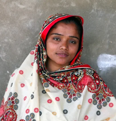
Amna, the Beneficiary Support Seeker:
40-year-old single mother facing economic challenges. She is looking for support to provide a better life for her children.
In search of financial assistance and resources to improve her family's living conditions. She needs a platform that is empathetic, easy to navigate, and provides clear information on available support programs.

Musa, the Corporate Partnership Manager:
45-year-old professional working in corporate social responsibility for a large company. He is responsible for establishing partnerships with charitable organizations.
Interested in finding reliable and impactful charitable organizations for potential partnerships. He needs a platform that showcases the foundation's projects, impact reports, and collaboration opportunities. Clear communication channels and documented success stories are crucial for decision-making
Problems Identified
We identified multiple problem statements
Who might we..
How might we streamline the donation process to make it quick and hassle-free for busy professionals like Nadia, ensuring transparency and accountability in reporting the impact of their contributions?
How might we create a user-friendly and empathetic interface for individuals like Aisha, making it easy for them to find and access the support programs they need, while also providing clear information on eligibility criteria?
How might we personalize the user journey for donors like Nadia, offering tailored project recommendations based on their interests and values, fostering a deeper connection and engagement with the foundation?
How might we streamline the donation process to make it quick and hassle-free for busy professionals like Nadia, ensuring transparency and accountability in reporting the impact of their contributions?
How might we create an accessible and inclusive platform for individuals with diverse needs and backgrounds, ensuring that users like Aisha can easily navigate and access information regardless of their technological literacy or physical abilities?
How might we optimize the website to effectively showcase the foundation's projects, impact reports, and collaboration opportunities, catering to corporate partners like Musa who are seeking reliable and impactful charitable organizations for potential partnerships?
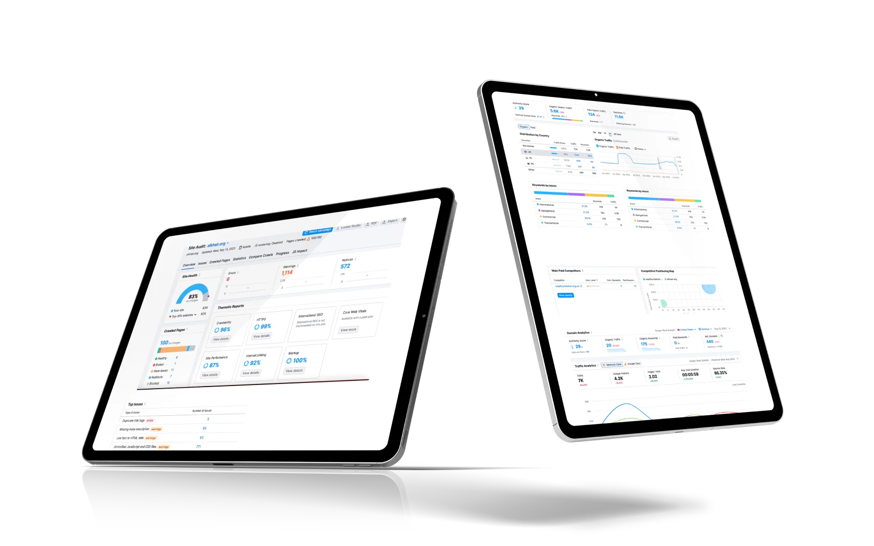
Current Site Analysis
Usability Testing

Add a Call-to-Action Button to the Upper Right
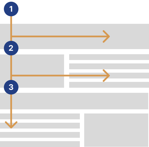
According to eyetracking research done by the Nielsen Norman Group, visitors scan websites in an “F” shape. They start in the upper left-hand corner, move to the upper right-hand corner, and then mostly stick to the left side of the page as they scroll down. The upper left corner should contain your logo, but what about the upper right?
Well, the upper right-hand corner is an excellent location for your primary call-to-action button.
This button should link visitors somewhere you’d like them to go. Including this button in your nonprofit nav bar—and in this particular location—will dramatically increase the likelihood of a visitor taking that next step with your organization.

If you have multiple key actions that your visitors could take, then you could include a secondary call-to-action button as well. This secondary button should be in a more muted color (usually white, grey, or transparent)—and definitely not the same color as your primary button.

For any nonprofit website navigation menu, the fewer the items, the better.
Contact number can be replaced with a phone icon.
Ensure Consistency in Nav Bar Wording
For example, here are a few different approaches you could take to help keep your nav menu’s phrasing and focus consistent:
- Object-Based: About, Programs, Volunteer, News, Contact, Donate
- Organization-Focused: About Us, Our Programs, Volunteer, Our News, Contact Us, Support Us
- Alternate Organization-Focused: Who We Are, How We Help, Get Involved, News, Contact Us, Donate
- Action-Based: About, Understand, Apply, Learn, Contact, Donate
- Audience-Based: About, Students, Volunteers, News, Contact, Supporters

Avoid internal jargon.
You can certainly use your own preferred terms for your programs, beneficiaries, membership levels, etc.—but in the primary navigation of your nonprofit website, you should stick with a term that anyone can understand.
Limit the Number of Clicks
Common “website wisdom” once maintained that any action you want a visitor to perform should be possible within three clicks or less from your Home page.
The core idea is that your visitors should be able to find the content they need as quickly as possible
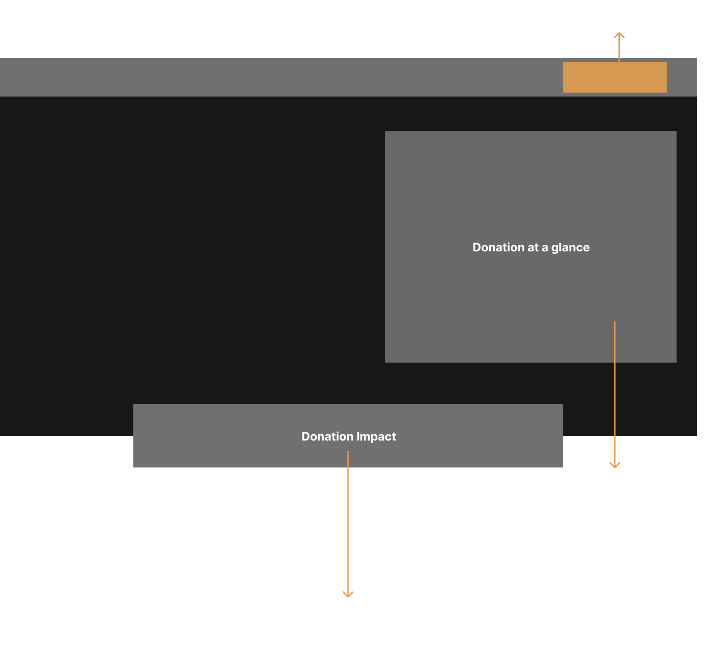
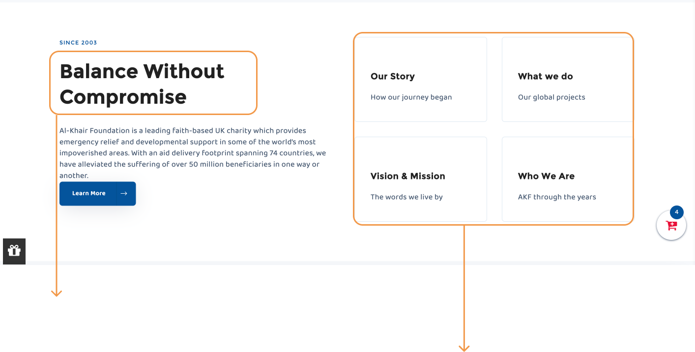
The heading of a fold should transmits the main idea in a single sentence for the whole content
Your landing page visitors need to understand (1) your story, (2) what you do, (3) your mission and (3) why they should stick around at first glance without wondering and going for multiple steps just to get to know you. If you’re at all unclear about any of these things, you’ll lose credibility and the visitor.

The heading of a fold should transmits the main idea in a single sentence for the whole content
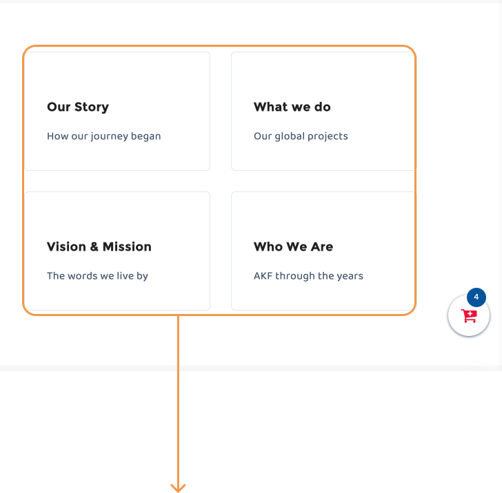
The heading of a fold should transmits the main idea in a single sentence for the whole content
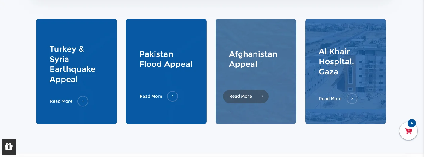
Lack of Clarity:
- Users may not immediately understand the purpose of the appeals listed in the cards. The lack of descriptive information may leave them confused about the cause or issue being addressed.
Missing Emotional Connection:
- The absence of compelling content, such as images or stories, makes it challenging to connect with the cause on an emotional level. Users might not feel motivated to take action.
Low Engagement:
- The generic “Read More” CTA does not create a sense of urgency or drive users towards meaningful actions. It may lead to a high bounce rate, as users might not be compelled to explore further.
Proposed Solution:
To address these pain points and improve the user experience on the landing page, we suggest the following changes:
1. Enhanced Card Content:
- Each card should clearly state the problem or cause being addressed. Provide concise but informative descriptions that explain why donations are needed. Users should be able to grasp the importance of the cause at a glance.
2. Engaging Visuals:
- Incorporate images or other engaging visual content that directly relates to the appeal. Visuals can evoke emotions and create a stronger connection with the cause.
3. Compelling Call-to-Action (CTA):
- Replace the vague “Read More” CTA with a more action-oriented phrase, such as “Support Now.” This encourages users to take immediate action and reinforces the idea that their contribution can make a difference.


Footer
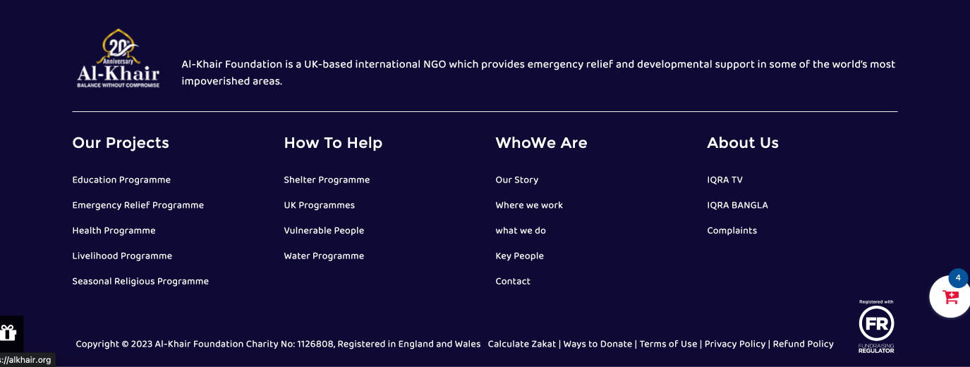
Unnecessary Data:
- The footer contained redundant and non-essential information that cluttered the page and could overwhelm users.
Repetitive Content:
- Some information may have been duplicated from other parts of the website, leading to a disjointed and confusing user experience
Donation Page
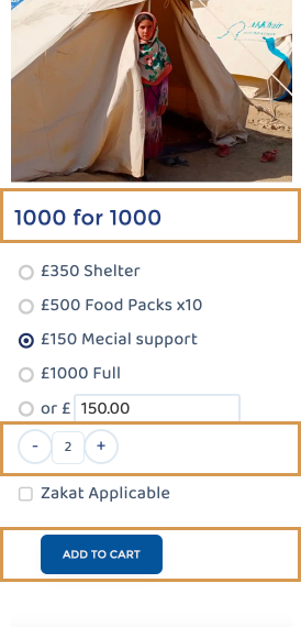
Unclear Heading:
- The heading “1000 for 1000” lacks clarity and doesn’t effectively communicate the purpose of the donation. Users might be confused about what exactly they are donating for.
Quantity Selection Complexity:
- Including an option to select quantity on a donation card can add unnecessary complexity. Users may not be sure why they would want to donate multiple times, and it might discourage single, higher-value donations.
Generic CTA:
- The “Add to Cart” CTA lacks urgency and emotional appeal. It doesn’t effectively convey the importance of the donation or encourage immediate action.
Sample Wireframe Design


Proposed Redesign:
Clear and Informative Heading:
- Replace the unclear heading with a concise, descriptive header that clearly states the purpose of the donation. For example, “Feed a Family in Need.”
Amount Selection with Context:
Instead of just radio buttons, provide explanations or context for each donation amount option.
- Shelter: £350 - Provide shelter for those in need.
- Food Packs x10: £500 - Help feed 10 families.
- Medical Support: £150 - Aid medical expenses for the needy.
- Full: £1000 - Make a full donation to make a big impact.
Emotive CTA:
- Change the CTA to something more emotionally compelling and action-oriented, such as “Join the cause” or “Make a Difference.” This should convey a sense of urgency and importance.
Progress Bar:
- Include a progress bar on the donation card that visually shows how many families have been fed so far. This can motivate users by demonstrating the impact of their contribution and create a sense of community.
Benefits of the Redesigned Donation Card:
The redesigned donation card offers several advantages:
- 1. Clarity and Purpose:
- Users will immediately understand the purpose of the donation, making them more likely to engage.
- 2. Improved Donation Experience:
- By simplifying the card and removing unnecessary options, you reduce friction in the donation process.
- 3. Emotional Appeal:
- The emotive CTA and progress bar create a more emotionally engaging experience, motivating users to contribute.
- 4. Enhanced Transparency:
- The progress bar adds transparency and trust by showing the real-time impact of donations.
- 5. Increased Conversion:
- The combination of clear messaging, emotional appeal, and transparency is likely to increase conversion rates and encourage more significant donations.
Search Field

Pain Points:
- Users may be confused about what they are expected to search for on a donation page. Without clear guidance or a specific reason for using the search box, it may lead to frustration.
- An empty search box can be distracting, as it may divert users’ attention away from the primary donation process. This distraction can negatively impact conversion rates.
Proposed Changes:
- If there is a legitimate reason for having a search box on the donation page, clearly communicate its purpose to users. For example, if you have a catalog of different donation options or projects, you can explain that the search box helps users find specific causes they want to support.
- If a search feature is essential to your donation page, consider redesigning it to be more user-friendly and contextually relevant. For example, if you offer various charitable projects, provide filters or categories to help users narrow down their choices before searching.
- Recommendations and suggestions while searching.

The placeholder text for the search box on the donation page should be concise, clear, and relevant to its purpose. Since the search box’s primary role is to help users find specific causes or donation options, the placeholder should reflect this intent.
Side Menu/Filters

The side navigation on the donation page appears to serve as a filtering mechanism for users to narrow down their choices among various donation options. However, some potential pain points of a user are:
Pain Points
Navigation Clarity:
- The current navigation labels, such as “ONE DONATION TWO NATIONS” and “SUPPORT A FAMILY,” while intriguing, may not immediately convey the nature of the donations or causes they represent. Users may have to click through them to understand their options fully.
Information Overload:
- The long list of donation options, including specific appeals and projects, can overwhelm users. This might lead to choice paralysis or confusion.
Lack of Categorization:
- The donation options appear to be presented in a flat list without clear categorization or organization. This could make it challenging for users to find donations related to their specific interests or preferences.

- Use more descriptive labels for the navigation options. For example, instead of “ONE DONATION TWO NATIONS,” consider a label like “Cross-Border Donations” or “Global Impact.”
- Group related donation options under clear categories. For instance:
- Emergency Response:
- Libya Floods Emergency Appeal
- Morocco Emergency Appeal
- Pakistan Emergency
- Turkey & Syria Earthquake Appeal
- Special Projects:
- Gaza Under Attack
- Sadaqah Jariyah
- Livelihood
- Support a Family:
- Pakistan Flood Appeal
- Afghanistan Appeal
- Zakat:
- [Zakat-related options]
- Emergency Response:
- Consider using collapsible categories to allow users to expand or collapse sections based on their interests. This keeps the page visually less overwhelming while providing access to detailed information when needed.
In summary, the proposed solution aims to make the side navigation on the donation page more user-friendly, organized, and efficient in helping users find and select the causes or donations that resonate with them. This should result in a more positive donation page experience and potentially lead to increased donations and support for your organization’s initiatives.
Sorting
Adding a “Sort by” Filter
The addition of a “Sort by” filter for Zakat or Sadaqah is a valuable feature that can enhance the user experience on your donation page. Here’s how this filter can be beneficial and some considerations for its implementation:
Benefits:
- Customization: Users can tailor their donation search based on specific criteria, making it easier for them to find the most relevant options.
- Transparency: Sorting options can provide transparency, allowing users to see how donations are categorized and ranked.
- Improved Decision-Making: Users can prioritize donation options based on their preferences, such as donation amount, impact, or urgency.
- Enhanced User Control: This feature gives users greater control over their donation choices, aligning with their values and interests.
Considerations for Implementation:
- Sorting Criteria: Determine which sorting criteria will be available in the “Sort by” filter. Common criteria might include:
- Donation Amount (ascending or descending)
- Impact Level (e.g., high-impact first)
- Urgency (e.g., most urgent appeals first)
- Alphabetical Order (A-Z or Z-A)
- Date Added (newest or oldest)
- Clear UI Design: Ensure that the user interface for the “Sort by” filter is intuitive and easy to use. Use clear labels and appropriate UI elements (e.g., dropdown menus or radio buttons) for sorting options.
- Default Sorting: Decide on a default sorting order that aligns with the most common user preferences or the organization’s priorities.
- User Guidance: Provide brief instructions or tooltips to help users understand the purpose and usage of the “Sort by” filter.
- Responsive Design: Ensure that the filter works seamlessly on both desktop and mobile devices. Consider how the filter interacts with the rest of the page layout on smaller screens.
- Testing: Conduct usability testing or gather user feedback to refine the sorting options and the overall user experience.
- Accessibility: Ensure that the filter is accessible to users with disabilities and complies with web accessibility standards.
- Performance: Optimize the filter’s performance to ensure quick loading and responsiveness, even when dealing with a large number of donation options.
- Maintenance: Regularly update the sorting options to reflect changing priorities or new donations. Remove or archive outdated options as needed.
By adding a “Sort by” filter for Zakat or Sadaqah donations, you can empower users to find and support causes that align with their preferences and priorities. This customization enhances the user experience and encourages greater engagement with your organization’s initiatives.

Style Guide
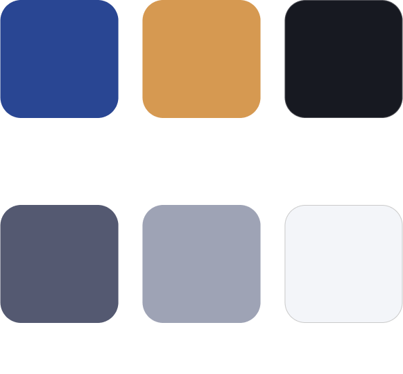
Colours
Primaries, shades and text and any other color style used in Intrno.
Typography
Headings, body and other common text elements.

Paragraph
Paragraph, body and other common text elements.

Text
This is some text inside of a div block.

List
This is some List inside of a div block.

Buttons
Component, text style and size variations


Icons
Little pictures that help out in various ways.
Interface
Block Quotes

Contact Form
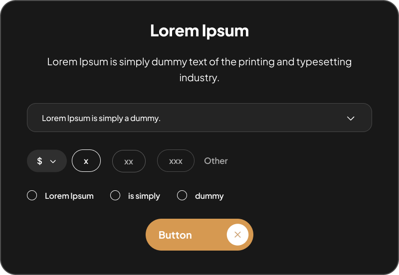
Cards


Lorem Ipsum
Lorem ipsum dolor sit amet, consectetur adipiscing elit. Sed bibendum massa
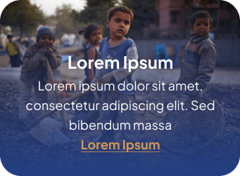
Lorem Ipsum
Lorem ipsum dolor sit amet, consectetur adipiscing elit. Sed bibendum massa

Low Fidelity Mock-ups
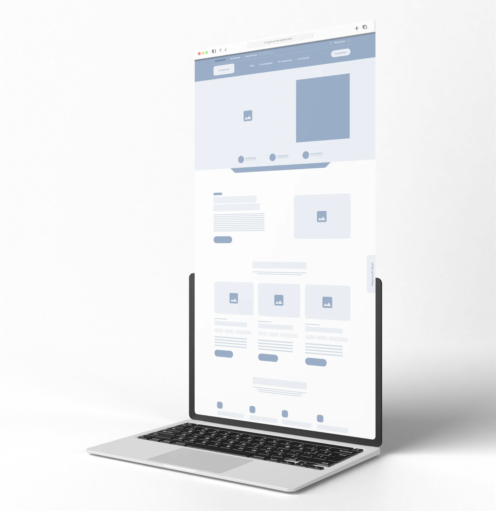
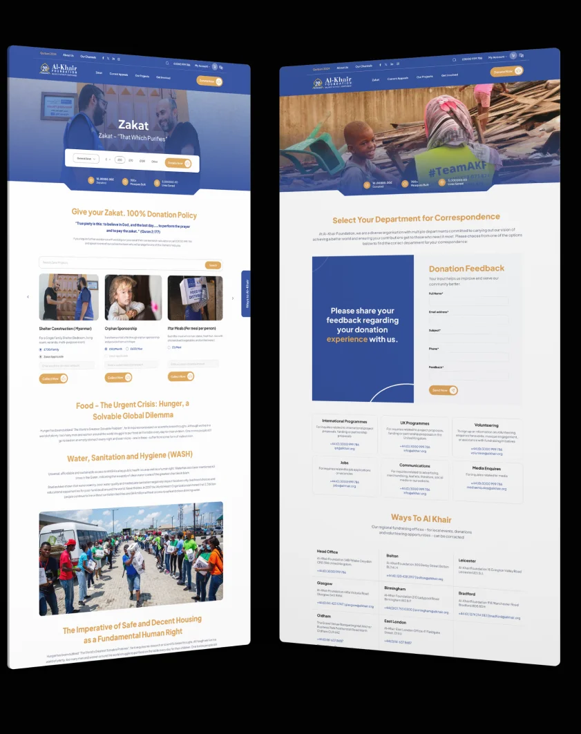
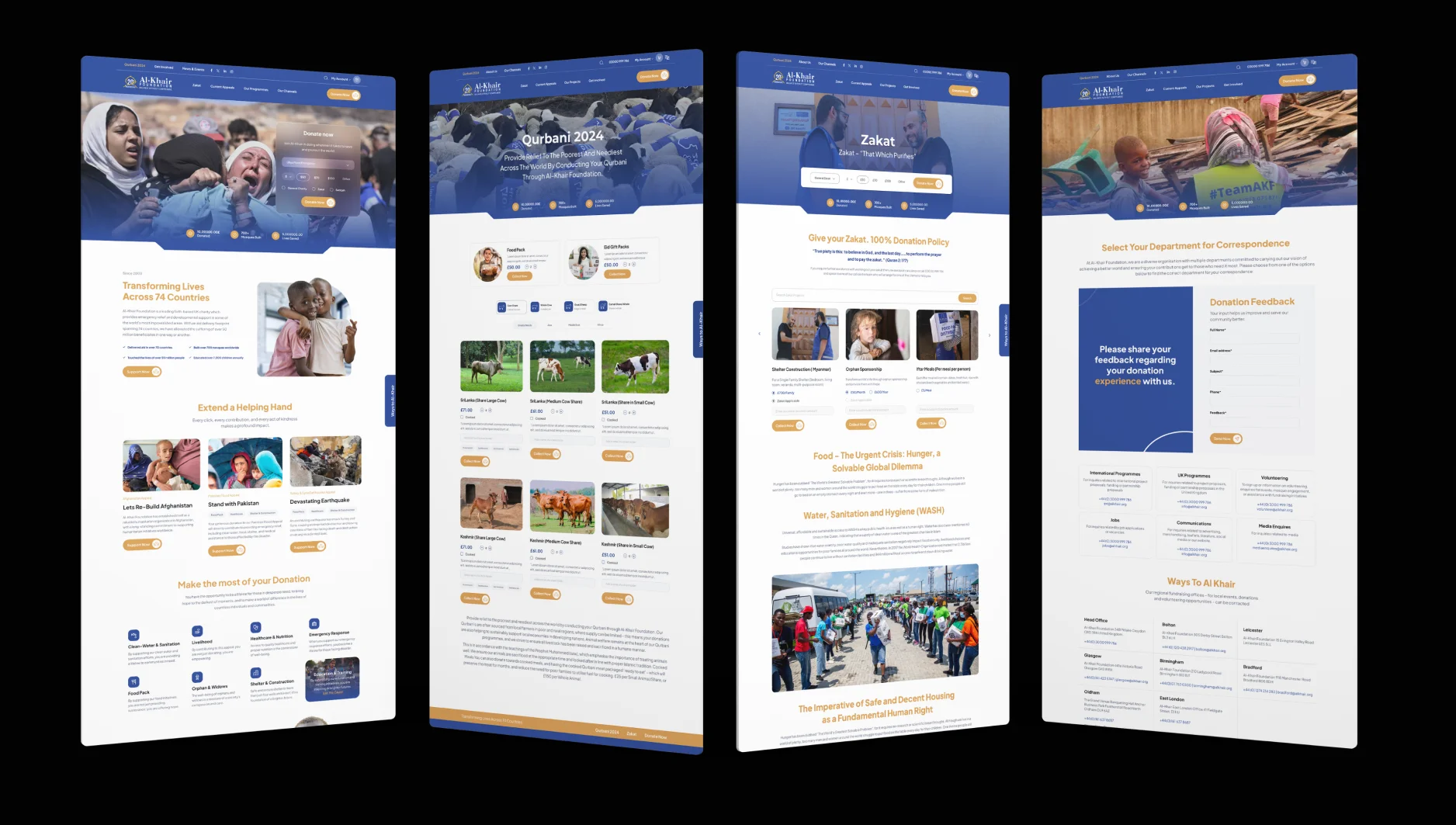
Hi-Fidelity Mock-ups
