



This project aims to improve the usability of the internet archive tools for use by college students and faculty as a research tool for creative and scholarly research. Specific focus will be given to the search engine and navigation to improve the user experience

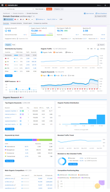
We conducted keyword research on the Internet Archive to narrow the scope of our case study. The website provided abundant multimedia resources for free. Our research aims to determine what the most valuable position of the Internet Archive is and improve the effectiveness of the entire user flow. Using the keyword research tool “SEMrush,” we realized that “Book Download” has the highest monthly search volume. As a result, we decided to limit our design to
searching for a book.
Interviewed the existing user
Created User Personas
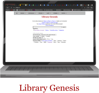
Finalized book searching flow
Performed user testing of the current website
Analyzed and short-listed problems
Designed Wireframes
Modified High-Fidelity Design
Conduct Usability Test on High-Fidelity Design
Made changes to High-Fidelity Design
Deliver and Present

Key Features
Key Features

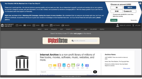
Long lines of text which is hard to read and follow:
According to Understanding SC 1.4.8 from World Wide Web Consortium (W3C),
“For the visual presentation of blocks of text, Width is no more than 80 characters or glyphs (40 if CJK).”
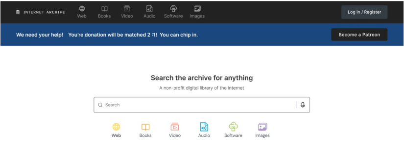
Shorten the wording and the length of the notification bar and makes it readable


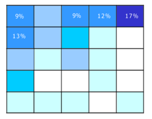
F Shaped scanning pattern
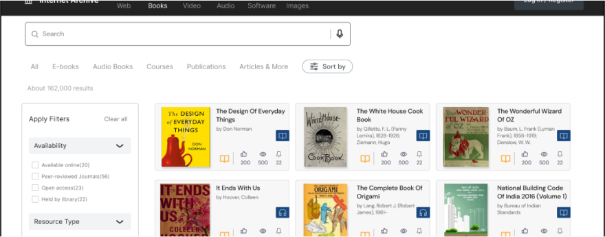


Format:
We conducted a Questionnaire based on SUS (System Usability Scale)
There are 10 Questions with 5 responses in total
Tasks are to find and download a book
Background:
We have 5 users and they are under 30 years old, 2 of them are university students and 3 of them are working professionals.
Feedback:
The feature for filter items is easier to use
The site is Well-organized
Clean and uncluttered.
Can get information quickly
Time on task is approximately 1 minute
Errors are 3 among 5 interviewees
While we were embarking on a website redesign project, there were some things we thought about. Questions like: how would we describe the brand? Who is Archive’s ideal customer? What is the main focus of the website? What do we want to achieve through the website? We tried to make changes that make it easier for the users to navigate and use the website. We achieved this by providing as few steps as possible, following a logical train of thought, and providing clear actions for taking the next step.
